


 MENU
MENU“Excellence is to do a common thing in an uncommon way.”
— Booker T. Washington
In previous blogs, I’ve given the motivation for the Trillion Cell Challenge. In this blog I’d like to introduce the details of the challenge and give our results to date.
Trillion-cell CFD Dataset
At this time there is no real trillion-cell CFD dataset. The computer required to run this case simply doesn’t exist yet. So, for our challenge, we have to generate a “simulated” CFD dataset. In our case, we create a cylindrical grid of desired density with a single Rankine vortex for the velocity field and an assumed distribution of a scalar variable for testing the generation of isosurfaces. This is a fairly gentle test of the scaling as the complexity of the flow field doesn’t increase with grid density. In an actual CFD case, you’d expect additional flow features (smaller scale vortices, shock waves, or boundary-layer separations) as the grid density is increased. Still, this is a good first step in testing the scaling of visualization algorithms.
The results of the visualization look like these images below. The figure on the left is an isosurface of the scalar variable and the figure on the right is streamtraces for the Rankine vortex.
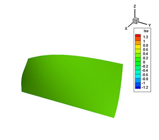
Isosurface of the scalar
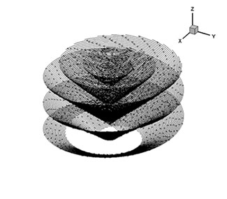
Streamtraces for the Rankine vortex.
 Computer System for the Challenge
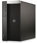
The computer system we used for the Trillion Cell Challenge is pictured here. This is actually a picture of my work computer, a Dell Precision T7610 contain dual 8-core Intel Xeon processors, an NVIDIA Quadro K4000 video card, 128GB of memory, and a 16TB Raid5 external hard-disk array. The system is probably a little more advanced than the typical workstation today, but it will no doubt be considered incredibly slow and archaic in 2030.
Timing Results
To date, we’ve performed these visualizations for a series of eleven grid densities from 1000 cells to 300 billion cells. The timing results are shown in this fairly complicated plot. Let me explain the various lines.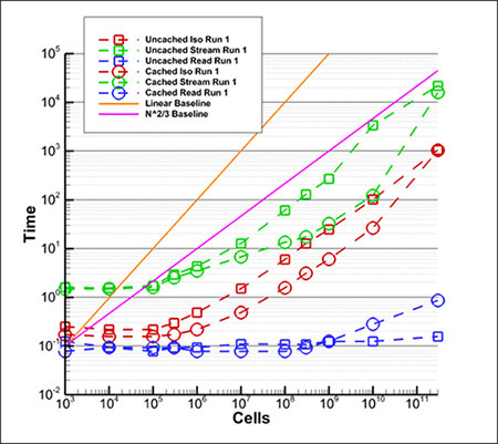
- Blue lines are the time (in seconds) to read the file meta-data from disk.
- Red lines are the time to create an isosurface.
- Green lines are the time to create the streamtraces.
- Square symbols mark results where the computer was rebooted to clear any disk cache.
- Circles mark results where the case was run several times to ensure full disk caching.
- The orange line indicates the slope where the time to perform the operation scales linearly with the number of cells (i.e. O(N)).
- The pink line is the slope where the time to perform the operation scales with the number of cells to the 2/3 power (i.e. O(N(2/3))) .
As you can see, the cached results are often substantially faster that the un-cached results. It is a log-log plot, so the slope of lines indicates the scaling of algorithm. Standard algorithms are O(N) and we expect that our algorithm is O(N(2/3)). You can see that the isosurface generation (red lines) are indeed parallel to the pink line over most of their length so they scale with N(2/3).
Likewise for the streamline generation (green lines). In both cases there is an uptick in the line slope for the last point (300 billion cells). This indicates some O(N) scaling that must be investigated.
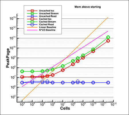 Memory Usage Results
The previous plot was performance measured in time (seconds), but the memory used is equally important. The plot at left shows the amount of memory used. The symbols and line colors mean the same thing as they did in the timing plot. As with time, the required memory scales with N(2/3).
Sublinear Scaling is Important.
Without the sublinear scaling, it would be impossible to visualize a dataset larger than two billion cells on this computer. Because of the sublinear scaling, we’ve already visualized a 300-billion cell dataset. And we will soon visualize a trillion-cell dataset. The sublinear scaling makes it possible to accomplish what was formerly impossible!
Analysis and Visualization Techniques
Of course, Tecplot software is used for analysis as well as visualization. In the next blog, I’ll discuss the technique used to minimize data I/O when analyzing and visualizing computed variables, and how we maintain sublinear scaling when altering the data.
Blogs in the Trillion Cell Grand Challenge Series
Blog #1 The Trillion Cell Grand Challenge
Blog #2 Why One Trillion Cells?
Blog #3 What Obstacles Stand Between Us and One Trillion Cells?
Blog #4 Intelligently Defeating the I/O Bottleneck
Blog #5 Scaling to 300 Billion Cells – Results To Date
Blog #6 SZL Data Analysis—Making It Scale Sub-linearly
Blog #7 Serendipitous Side Effect of SZL Technology