


 MENU
MENUHere are 10 tips for creating publication quality plots that make an impact. The Tecplot 360 User’s Manual has chapters on all of the topics discussed below and can be found in our documentation. Explore the Plot Gallery with hundreds of plot examples.
Learn the best way to share your results with key players. Choosing the right output formats, color and layout help you present your results more effectively in print and online.
Tecplot 360 is a visualization tool, which is designed to help you communicate your data. Take advantage of options such as specular highlights and opacity effects to make your image really “pop.” Rotate your image to find visually engaging angles and views.
Also, don’t forget to take advantage of antialiasing and supersampling. When it comes right down to it, you need to look good in front of your peers. When printing something for publication, you will almost always want to use antialiasing. This will take out “jagged” or rough edges and show a nice, smooth image.
Tip 2: Rule of Thirds

2D Mach turn rate. This one is called the “doghouse plot.” Visit our Plot Gallery to explore hundreds of plots and animations made with Tecplot software.
You want your plot layouts to be visually exciting and engage the viewer’s interest. Simply centering your images rarely produces the “wow” effect you are looking for. One of the best ways to bring visual energy to your printed plot is to divide your layout into thirds vertically and horizontally, forming four points of equal distance. Aligning the most important objects (titles, plots, images) to these points will make your layouts more engaging.
Tip 3: Annotation
- Text & Fonts: When using multiple text blocks, create an obvious and consistent size hierarchy that makes a distinct difference between titles and sub-titles. Avoid cluttering the layout with different fonts. Your message will get lost in a jumble of fonts, so use no more than two — one for headings and one for text. As an alternative, use different fonts within the same font family, such as bold for the main title and regular for secondary headers. Avoid overlapping labels or text.
- Reverses: The eye is naturally drawn to reversed type (white or light text on black or dark background) so use it sparingly. Reverses are easy to read, but more tiring to the eyes. Also, thin fonts tend to disappear when reversed.
- Numbers: Use truncated numbers for contour levels, axis labeling, reference vector magnitude, and reference scatter size.
- Keys: Include a clearly defined color legend, as well as a title block with company name, logo and plot title.
- Boxes: When using box borders, always offset text from the edges with a nice margin. Boxes and rules can be a good way to show off important information. Just make sure not to use a box for every element, or nothing will stand out from the crowd.
- Arrows: Draw attention to objects of interest with arrows and text.
Tip 4: Color Usage
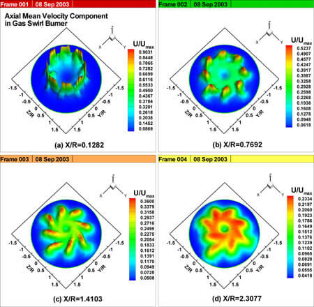
These figures indicate the non-dimensional axial mean velocity components divided with maximum axial mean velocity Umax measured in the Y-Z plane of gas swirl burner. Visit the Plot Gallery to explore other layout plots.
Use color for impact. If it is thrown around everywhere, it loses that effect. Use a contrasting color as your background to provide optimum readability. If you have multiple colors, use a white background. Do not use complementary colors such as blue and orange. When these two colors are used side by side, the eye has trouble focusing on both at the same time. In general, make sure eyes are drawn to important data and not insignificant but visually prominent objects (avoid using lots of color at the sides of your plots). White and empty space are good — let your data speak for itself. Also beware, dark backgrounds may look good on your monitor, but can display poorly when printed.
Tip 5: Size
Make sure to keep your final plot size in mind when adding annotation. Plots destined for publication need large details, and large on-screen text will result in readable published text. Use larger graphics to communicate the most important goals of your layout. Smaller graphics are of lesser importance. When space is at a premium, drop the smaller, less important elements first.
Tip 6: Paint a complete picture
The Boeing 747 wing shows how overlaid XY graphs allow viewers to easily associate each XY plot with specific 3D slices. Labels identify actual contour values on the wing versus using a look-up table. In general, embedding details within your plot like this helps the viewer avoid searching the page for further explanation. Combining different plot types in a layout also paints a more complete picture than several independent images. Likewise, multiple views of the same or interrelated data makes it easier to comprehend your results.

Figure 2. Pressure coefficient at various spanwise locations on the Boeing 747 at a cruise speed of Mach .85.
Tip 7: Accuracy
Be sure to represent your data accurately. Avoid hiding edges and imperfections with lighting, viewing angles and smoothing. Steer clear of high degrees of perspective projection when the relative size of various plot parts is important. And always cite a reference for the data.
Tip 8: Use Raster Images
Raster images (TIFF, PNG, JPEG) are sometimes called bit-mapped, and are the most versatile output formats. They support translucency and print easily. When outputting raster images, export the exact size you need, thus creating new output for every desired display size. Avoid stretching raster images beyond your target size, or you will start to lose resolution and quality. Resizing raster images distorts the original pixel information.
Tip 9: Alignment & Balance
Line up various objects and strive to create balance within your workspace. Everything on your page should align with something else. Tecplot’s grid is an effective tool to ensure that text and images align. Only break alignment for emphasis within a layout and use it sparingly. Try using text, axes, and geometries to balance the layout.

Proton beams accelerated to impact with liquid mercury.
Tip 10: Know your DPI
DPI stands for “Dots Per Inch”. Essentially it is how many dots of ink your printer will put in a square inch of paper. The magic number to remember is 300. A file is considered to be of magazine print-quality once it hits 300dpi.
To export an image height and width of, for example, 4 inches by 6 inches image at 300 DPI, set the frame dimensions to 4 inches by 6 inches. When exporting, select the Enter Width option in the Export dialog and enter a width of 1200 (4 times 300).
Unlike other visualization applications, Tecplot software does not limit your plot size to the screen size when exporting. You can create magazine-quality banners of your plots that are 10 feet high!
Try Tecplot 360 for Free