


 MENU
MENUHow to plot your data and present it to tell a clear, concise, and convincing story.
It may come as a shock to some of you, but here at Tecplot we have a thing for well-made plots and the presentations that they occupy. There is something eminently satisfying about looking at a set of data that has been thoughtfully reduced into the relevant facts necessary to enable sound engineering judgment. It is in service of that ideal that we have decided to put together a short blog series on how to make plots & presentations that tell a clear, concise, and convincing story.
Our goal isn’t to present anything profound – only to share practical reminders of the importance of effective communication in engineering. An expert engineer doesn’t simply need to understand the science of their discipline – they need to also know how to convey the relevant facts to their colleagues and stimulate productive discussion.
In this first post we’ll tackle something quite tangible – consistency. Consistency is important for comparisons between datasets (or between regions of the same dataset) because it enables the audience to identify significant differences more easily. If your audience is presented with plots that convey similar datasets but use varying format, scale, color, orientation, etc., it distracts them and takes the focus away from what really matters – the story behind the data.
Make Reading Easy
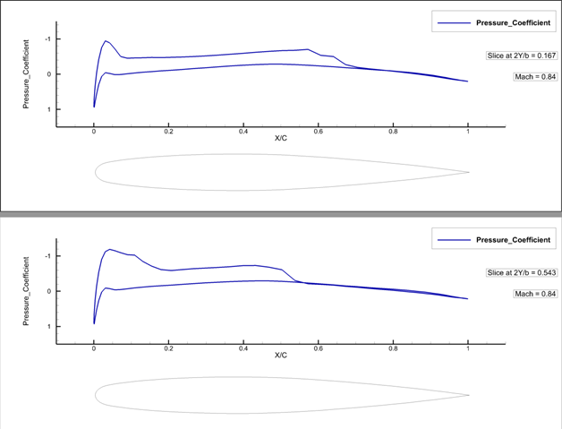
The image at right is an example of two pressure coefficient distribution plots at discrete spanwise locations; we’ll dive into a few of the ways this plot uses consistency to enhance its readability.
- The X-axis has the same range in both plots, same with the Y-axis.
- All axis labels are spaced consistently in both plots. Similarly, labels for the slice location, Mach number, and Pressure_Coefficient are consistently displayed for both plots.
- The line color is the same shade of blue to reinforce that the same variable is plotted for each slice.
How do you decide what to keep consistent and what to vary? That will depend on the data you are presenting, the type of plot you’re using, and the differences you wish to highlight.
In this example, the two Cp plots at different spanwise locations demonstrate the relative position of the pressure change due the lambda shock structure that is characteristic of the Onera M6 wing.
Receive Tips and Tricks like this directly to your inbox – Subscribe to Tecplot »
Highlight Critical Insights
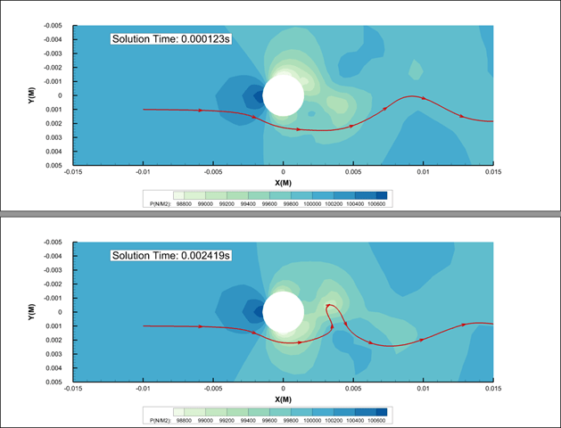
Line plots are critical for deriving actionable insights from most engineering analyses, but they aren’t the only types of plots that can be useful. The 2D contour plot at right is a great example of how consistency can be used to compare changes in a dataset over time.
This 2D contour plot compares the pressure of fluid flow around a rotating cylinder at two different time steps. Also included is a single streamline to demonstrate the change in the vortex shedding over time.
We have kept our axis labels, markers, and annotations consistent for easy readability. In addition, we have:
- Fixed the contour levels to make an easier visual comparison of the flowfield pressure changes.
- Seeded the streamlines upstream of the cylinder at the same location for both plots.
If the contour levels or the streamline location varied between the two plots, you could easily make some inaccurate assumptions about the fluid flow.
Fix the Perspective
Our last example is a 3D contour plot using the Onera M6 wing. The image below is similar to the 2D contour plot in that we’ve kept our contour levels, colormap, and labels consistent between frames. However, when comparing 3D plots it’s important to consider how the 3D perspective can affect your ability to make an unbiased assessment.
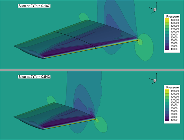
The image shows a fixed perspective, which includes the pan, zoom, and rotation settings. You’ll notice that because the volume slices are at different locations the wing appears to move between frames. But the wing is fixed in place. With this approach, it is immediately clear that the plot is not comparing flow states at the same slice location for two different solutions.
Keep the Consistency
Ultimately there are few hard and fast rules when it comes to formatting plots. And it is certainly worth taking the time to ensure that the critical insights from your analyses are not obscured by inconsistency across your plots. Consistency has the most impact when comparing two plots side by side. But don’t underestimate the value of maintaining consistency throughout your presentations – and even between different presentations. Consistency will establish a presentation style that your audience will have an easier time digesting.
Consistency is one tactic to making your plots and your presentations easier to understand. We will explore more plotting tips and tricks in future posts.
Read Blog #2: Know Your Audience
Receive Tips and Tricks from Tecplot