


 MENU
MENUWelcome back for another installment of our blog series where we talk about ways to improve your visual communication in plots & presentations. Our first post examined the importance of consistency in your plots. Today we’re going to discuss how to tailor your plots and presentations based on your audience. Creating a presentation that delves just deep enough to give your audience context and confidence in your conclusions and recommendations is the key to keeping your audience engaged but not overwhelmed.
When you spend days, weeks, or even months creating a thorough test or simulation it can be tempting to showcase every aspect of your work. But depending on who you are presenting to, that approach may not work. There are endless ways to categorize and describe different audiences – and each one is unique to an extent. For the purposes of this blog we’ll explore three very broad categories:
- Technical – for example, subject matter experts
- Generally technical – technical management or experts in separate disciplines
- Non-technical – business leaders, the general public, etc.
Each audience has different goals, background knowledge, and interest in the material. Even when discussing the exact same project or research you may wish to present different plots, takeaways, and recommendations. Let’s explore some examples of what this might look like.
Technical
When your audience is predominately folks who have an equal or greater knowledge of your discipline – it is worth taking the time to make sure they believe your results. To put it simply – technical audiences are interested in understanding the “how” for a set of analyses. For a simulation or test engineer this may take the form of presenting low-level details of how the simulation or test was set-up, what assumptions were made, and any possible sources of error.
In the world of CFD one might communicate the “how” by including an explanation of your solver settings (limiters, turbulence models, etc.), plots of any computational mesh sensitivity studies that were performed, and graph of your force & moment residuals to highlight how well your solver converged. After you have proved that your simulation or experiment was performed following best practices, you can continue to dive into the relevant results. Another great way to ensure your audience has confidence in your simulation results is to show a comparison to experimental data for a particular case, like in the example below:
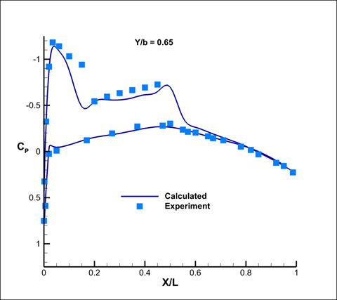
When presenting simulation results it can be useful to present alongside empirical data, when available. You might not have test data for every point of interest – but showing agreement to experiment at a few key control points can give your audience greater confidence in your results. The image above shows that the chordwise pressure coefficient distributions for the simulation closely match the measurements from experiment at multiple spanwise locations.
Generally Technical
“Generally technical” is a very vague definition – so what this audience looks like will vary widely depending on your role and the other disciplines that you interface with. For purposes of this blog post though – we’ll assume that the data you want to present from a simulation or test has implications for one or more technical groups that are working on the same project. If the technical folks wanted to know “how”, the generally technical folks want to know “ What were your results?”
If we look at the development of a gas turbine engine as an example – a CFD analysis by the turbine aero team might be important to the heat transfer team, and BOTH the CFD analysis and the thermal analysis might be important to the structures team for their finite element analysis. To take things a step further – the results of the finite element analysis may be very important to the service engineering department. As you are presenting your findings to adjacent teams you will want to avoid diving too deep into the nuances of your discipline and instead focus on presenting the assumptions & the results that are relevant to downstream activities. Look below for an example.
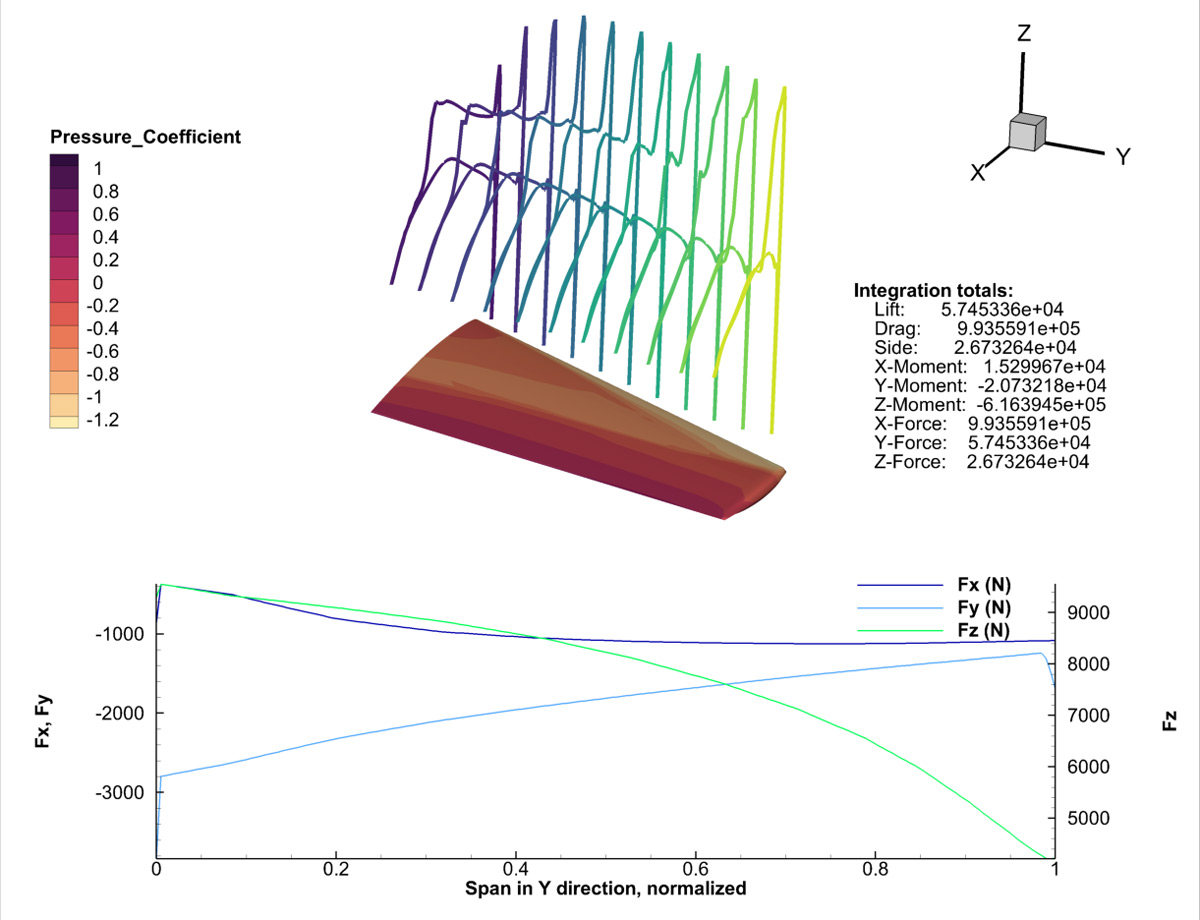
The plot above shows the cartesian forces along the span of a trapezoidal wing. A loads specialist might use a similar plot to communicate to downstream engineers, such as those in the structures group. It also provides the integrated quantities of interest without going into too much detail on how the values were computed or validated.
Non-Technical
For non-technical audiences it’s not about the detailed data or your assumptions – it’s about how the project, program, or business will be affected, usually in terms of cost or schedule, by what you’ve discovered. A non-technical audience may also be interested in the results of your study as it pertains to a future state projection or desired outcome. Non-technical audiences are generally less interested in the “how” or “what”, but instead in the “why” or “so-what” (why does this matter?).
As the engineer or scientist, it is perfectly acceptable, expected even, for you to communicate some technical data in your presentation – but keep things high level and avoid using too much jargon or trade specific symbols & abbreviations. Were you on a project to reduce the weight of a component or system? Communicate what your results say about the weight reduction efforts in terms of performance to goal. Did you contribute to a preliminary design study by performing CFD analyses on the design candidates? Consider showing a pareto diagram that highlights the design point most likely to satisfy the customer requirements. You can always keep more detailed plots in your backup slides to address any specific questions.
The image below serves as an interesting example of how to use technical plots in a way that is meaningful to a non-technical audience.

The image above shows a contour plot of ice-thickness data for a glacier. Perhaps, if juxtaposed with a plot of past measurements, or future predictions, this technical plot would serve as a valuable illustration of the dire impact of climate change on glacial melt. In the context of a broader presentation about climate change this could be a powerful way to communicate the “so-what” to a non-technical audience (I.e., “So, if climate change is not reversed, we will lose glaciers, a vital part of the ecosystem, within X number of years”).
Put It into Practice
At the end of the day, nobody is going to be able to understand your audience better than you. If you have the opportunity, reach out to members of your audience before and after your presentation to learn about what they are expecting to see, and get feedback on how well they felt the important information was communicated. Take note of any questions you are asked at the end of your presentation; they may help you to better prepare for the next time around.
Learning great presentation skills – both in the building of the plots and slides, and in the live presentation itself, is a life-long process that can always be improved. If you take the time to understand what data and visualizations will be most interesting to your audience, you will reap the benefits by becoming a more effective engineer. Stay tuned for future blog posts in this series on effective visual communication to learn more ways to improve.