


 MENU
MENUDesign, analysis, and testing are the fun parts of the job, but the best scientists and engineers go the extra mile to communicate their results clearly. When it comes time to present your work to others, it’s important to remember that the purpose of the presentation is clear communication, and the goal is (usually) to make or defend a decision. Today we’re going to highlight a few simple things that might improve the clarity and function of your plots and presentations.
This 4th blog in the series is about making more effective plots and presentations. Our first three posts covered the importance of consistency, the value of tailoring your presentations for your audience, and what to plot and what not to plot.
Match Expectations & Conventions
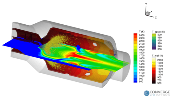
Figure 1. Thermal maps for each different region of interest (volume, spray, and wall).
The first thing to remember is that for a given industry, discipline, or company, there are always going to be certain conventions and expectations. Adhering to these expected conventions will help your audience quickly understand what they are seeing. This might have to do with the orientation of the images, the layout of your plots, the definition of your axes, the colormap chosen for your contours, the units of your variables, or even the sequence of your slides. One classic example in the field of aerodynamics is to present the coefficient of pressure distributions with the Y-axis ‘flipped’. If you must deviate from your audience’s expectations make sure you have a good reason for it and take care to explain the discrepancies.
Figure 1 was created for an audience of combustion engineers who are expecting to see multiple thermal maps, one for each of the different regions of interest (volume, spray, and wall). And, of course, they want to see the temperatures in Kelvin!
Stick to The Point
Most people don’t need to be told not to include slides that are unrelated to the topic – but oftentimes that guideline is too permissive. During the design, analysis, or test you may have generated or collected a lot of data. You may have also completed validation studies, performed mesh sensitivity experiments, reviewed historical datasets, or any number of ancillary activities. Just because those activities contributed to the overall success of your project does not mean that they need to take up space in your slide deck. Try to pare down your presentation to show only the minimum amount of information that is necessary. If you’re concerned that your audience may ask questions that extend beyond the core of your presentation you can always include that information in your backup slides.
Line Plots & Scalar Data Are Your Friends
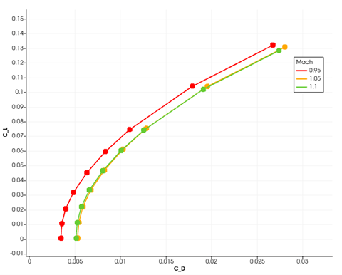
Figure 2. Drag polar at 3 separate Mach numbers.
Your post-processor shouldn’t function solely as a visualization tool, it’s also an analysis tool. What’s the difference?
Visualization turns raw data into pretty pictures (which certainly have their uses), but analysis refines the same raw data to make engineering decisions possible. All the isometric 3D contour maps in the world won’t give you a clear answer for how much drag your wing design produces at its cruise flight condition. And no, adding stream traces doesn’t change that. You plotted an isosurface of Mach number? That’s cool, but we still don’t know if the design meets the range requirements.
The point is simulation & test data are useful only if they help answer questions that provide guidance in engineering decision making. Line plots (for example, drag polars, resonance curves, distribution plots, etc.) can help make a complex dataset much easier to understand and act upon. Integrated quantities/scalar values are even easier to digest – and oftentimes these values play the biggest role in engineering decisions.
Figure 2 shows a drag polar at 3 separate Mach numbers. This simple line plot may not be the fanciest image ever produced – but drag polars are a staple of the aerodynamic design process and can inform a lot about the drag performance of your vehicle.
As always, these tips are intended to be general purpose. Conventions will vary widely depending on your discipline, and supporting plots will change based on the specific goals of your presentation. What should never change, no matter what, is your desire to make your presentations effective.
Stay Informed about Tecplot Products and Training
Tecplot 360 layouts, stylesheets, and scripts can help ensure consistency in your plots.