


 MENU
MENUJeff Chu is under a lot of pressure. He’s a graduate research assistant at The University of Texas Austin, analyzing turbulence by looking at how and where turbulence structures are formed as they flow over various surfaces. Chu’s research is being funded by the U.S. Air Force. The data is massive and the stakes are high. If the Air Force doesn’t see value in the terabytes of data produced by the research, his work will have been for naught.
To continue his research, Chu has to look at extremely small highly nonlinear physical phenomena and discover repeatable patterns within them. He also has to translate his discoveries into easy-to-grasp presentations.
Transforming Mega Data into New Knowledge
Working in the university’s Computational Fluid Physics Lab, Chu enthusiastically talks about his research.
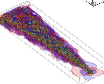
Vortex lines visualized in Tecplot 360 allow researchers to see how the lines twist and turn in real time
“I’m looking at tiny instances of turbulence, and asking fundamental questions about turbulence structures. We’re here to paint the picture of the mechanisms at play; why nature looks the way it does. Each test we run may add a tiny dot or a big brush stroke to that painting. Either way, every result is important.”
He and his fellow researchers use Direct Numerical Simulations (DNS — simulations of computational fluid dynamics) to model and analyze the most basic levels of flow. The next step is to look for meaningful structures within that data. This is a difficult nut to crack because there are so many things going on at once.
“The data is absolutely humongous,” Chu says. “A typical simulation can produce 1.5 terabytes of data.”
Analyzing Turbulence
Not long ago, researchers would sift through these mountains of DNS data to find the hidden “gold nuggets” of meaning by looking at 2D slices of vorticity and velocity. Looking at a large 3-dimensional data set in detail is out of the question due to its sheer size . But now, Chu uses Tecplot 360 as an easy and fast way to make sense of these enormous data sets. “Using Tecplot 360, I can get a result in a few seconds.”
“When I first look at the data,” Chu explains, “I just see a bunch of chaos. But after a while, I begin to see a pattern in all the mess. What could that pattern be? Which of all of these variables are connected? If I know that, I can calculate the variables and illustrate the connection. Tecplot 360 lets me zoom in to the area of the pattern so I can explore variables that may be involved in producing that pattern. I can test the possibilities of a connection on the fly, right as I’m looking at a picture.”
What’s most important to Chu is being able to look at simulations as they change in time.
“Without Tecplot 360, I’d have static, 2D photos showing a slice in time. But with Tecplot 360, I have 3-dimensional perspectives of what’s happening as time passes. That’s where the real information is.”
Tecplot 360 lets us see things happening over time that we simply could not see before. This interactivity and animation is essential. Looking at a visual representation of the data, I can go from idea to test to result in a few hours, or even as quick as few seconds for something simple!”
“To clearly illustrate my point, I use Tecplot 360 to fine-tune the picture. I can change the color scale to make the picture more understandable. I can rotate the camera to look at what’s happening from a particular angle. And I can zoom in to one tiny region — and get high-resolution results.”
Transforming Research into Presentations that Influence and Convince
When Chu transforms his results into an understandable presentation, he has only 20 minutes to propose the question he’s asking, explain his methodology, and use evidence to convince his audience that what he’s doing is correct and will contribute to extending the boundary of scientific knowledge.
“In a few seconds, they have to understand what I’m doing,” Chu says, “and why that’s valuable to them. Tecplot 360 is a tool I use to display data and explain ideas more persuasively.
Even with 3-D visualization, if I showed them all the data, it would be too much going on for them to process in such a short time. I use Tecplot 360 to dissect the chaos of turbulence. I sift out what’s not important and display the information that’s most relevant to the audience in small, digestible chunks. Conversely, I can also create figures and animations that show many variable at once. This would allow me to suggest ways that these variables are linked.”
One reason Chu likes to use Tecplot 360 for his presentations is because it generates the prettiest pictures – a quality Chu says is essential for persuasion. “To clearly illustrate my point, I use Tecplot 360 to fine-tune the picture. I can change the color scale to make the picture more understandable. I can rotate the camera to look at what’s happening from a particular angle. And I can zoom in to one tiny region — and get high-resolution results.”
Better Presentations Keep the Audience’s Interest
“When I first started working at the lab,” Chu recalls, “I did research for a year. But then our research grant was up for renewal. I used Tecplot 360 to create our presentation to the Air Force. It laid out what we had learned, what we wanted to study next, and what they would get out of it.
“The Air Force decision-makers were impressed and excited with what they saw in the Tecplot 360 videos. They had never seen anything like it.”
“They told us they could see that our effort was generating something of real value. They were very excited about what is now known — and what is possible to know. They were very impressed and can’t wait to see what’s next. There is no doubt they renewed because of what we were able to illustrate with Tecplot.”
The Purpose of Fundamental Research
The purpose of Air Force fundamental research is to push the envelope of scientific understanding. The Air Force understands that solid, scientific research like this can lead to new technologies that no one can predict beforehand.
But one possible application of this research may be to understand how wing surface design can reduce drag — and jet fuel consumption. The U.S. Defense Department is pushing hard to reduce its dependence on fossil fuels. And since the Air Force’s jet fuel bill in 2012 was about $7.6 billion1 — there could be millions in savings.
That, of course, would be good news for the Air Force. It could also dramatically reduce the Air Force’s carbon footprint. And that would be good news for the world.
Read more about this research in the Case Study >>
1“Smaller carbon footprint means fewer risks, official says” by Cheryl Pellerin, American Forces Press Service, Official Website of The U.S. Air Force, 1/20/2012