


 MENU
MENUBursting the Bubble on Traditional History Matching
Blog by Raja Olimuthu, Tecplot RS Product Manager
The big problem with traditional history match workflows is that they are cumbersome. Doing a well by well analysis is time consuming, and it can be difficult to get a holistic view of your reservoir.
A better way is to examine the history match spatially – that is in one view.
I want to show you a method that ties the production and historical data to the grid solution, giving you a deeper understanding of what is happening with the history match.
Stay with me here as I walk you through a real-world problem set using our solution, Tecplot RS.
History Match Dataset
Those of you who have seen me in person or on customer visits know this dataset all too well!
I am using the Eclipse SPE_EX simulation deck which includes:
- A grid solution
- A unified restart (dynamic variables)
- Initialization file (static variables)
- A unified summary file (XY production data)
In this particular dataset, the unified summary file includes the historical data, which I will use during the analysis. This workflow is applicable for any simulation source, not just Eclipse.
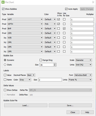
Bubble Pie Settings dialog
Download the simulation deck (SPE_EX.zip) to follow along
Bubble Pie Chart Setup
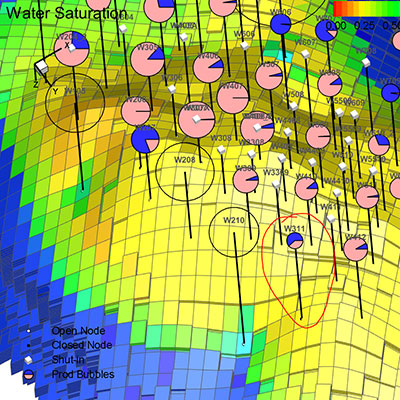
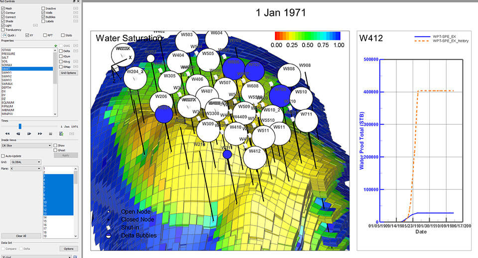
To spatially understand the accuracy of my history match, I’m going to use Bubble Pie Charts, a feature in Tecplot RS.
After I load data my data, I will activate the Bubble Pie Charts by checking the “Bubbles” checkbox, and set them up. For this particular dataset, I output the h variables in the unified summary file. I want to set up the bubbles to compare the simulated water production total with the historical totals. The production data from the unified summary file is populated into the Bubble Pie Settings dialog.
Settings walk-through:
- Assign WPT and WPTH for Bubble Pie Segments
- Assign WPTH Pie Segment color as pink
- Change bubble size to dynamic, and size each bubble by the size of the bottom hole pressure at each time step
- Size bubbles appropriately to match the data
Interpreting the Results
At this particular time step (Jan 1, 1971), the view shows the proportional magnitude of WPT vs. WPTH at each well. If pink is dominating the bubble, the well is underproducing at that particular time step. If blue is dominating, then it is overproducing. The relative size of the bubble represents the magnitude of the bottom hole pressure. I am able to quickly understand which wells are over or underproducing while animating my grid solution through time.
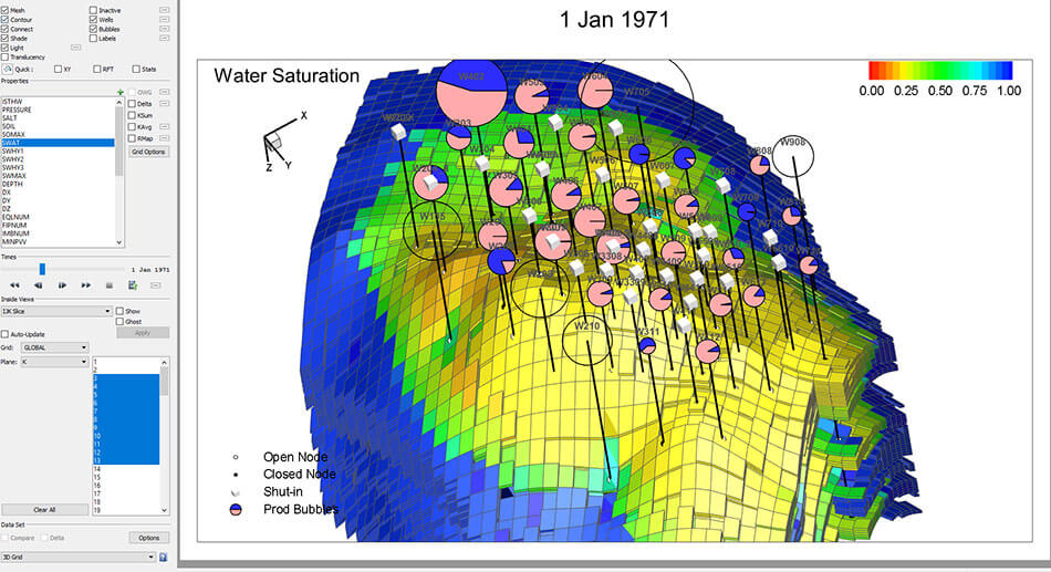
Proportional Magnitude of WPT vs. WPTH at Each Well
Tying in the Raw Results
I can understand this even more by taking advantage of the Quick XY functionality in Tecplot RS. Already, I have a spatial view that helps me accurately understand my history match. Using Quick XY, I can also understand the raw data – well by well – and link together quantitative and qualitative results.
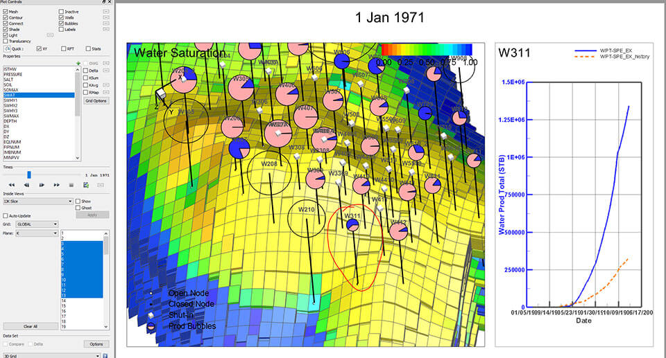
Quick XY
Delta Bubbles
In case I haven’t output the h variables in my results, or if I’m viewing results from a completely different simulator, I can still take full advantage of this workflow. This is an alternative setup from the one mentioned earlier in this post.
I can load in my grid solution, production data, and auxiliary historical data into Tecplot RS from any source. I’m going to Activate the Show Deltas checkbox and select my auxiliary history data from the Delta File dropdown.
Now I’m viewing the same data (SPE_EX simulation deck) but in a slightly different way. In this view, blue Bubbles indicate overproduction, white Bubbles indicate underproduction. The size of these bubbles reflect the normalized difference between the historical and simulated water production at each time step.
Delta Bubbles
Modify Grid Properties On-the-Fly
Bring the workflow full-circle by making necessary grid property modifications on-the-fly. In this case, the area in green is severely underproducing in water. I can use the Property Modifier tool in Tecplot RS to make the appropriate modifications to specified regions. I will choose to increase the permeability by 2000 in this region.
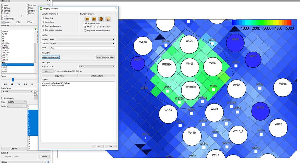
Modify Grid Properties
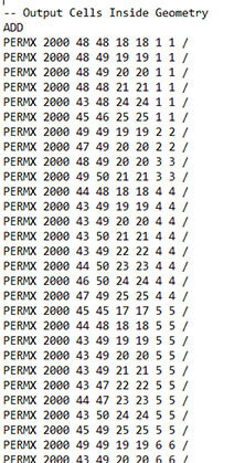
Output File
The resulting output file can then be used as an include file in your next simulation run. In this example, I have output only the multipliers. I could have chosen to output the entire array. The user has the option of outputting in different simulation types. See the video tutorial on Modifying Grid Properties.
Rinse and Repeat
Once you have run your next simulation, you can walk through this workflow again to analyze the accuracy of your history match.
Jim Gilman walks through these workflows in his Webinar History Match Efficiency with Tecplot RS.
And here is a 6-minute video tutorial on History Match Workflows.