


 MENU
MENUWelcome back for our third post in a blog series about making more effective plots and presentations. Our first two posts covered the importance of consistency and the value of tailoring your presentations for your audience. This time we’re keeping it very simple by discussing a few common pitfalls with plot styling and formatting, and how avoiding them can improve your plot game.
XY-Line Plots
Let’s start off with the simplest of them all – line plots. If you have an engineering or science degree you have made dozens, perhaps hundreds, of these simple plots. When you’re making them for your own reference, you might not pay much heed to styling and formatting. But when it comes time to communicate your results to outside parties they become almost as essential as the analysis itself.
How many lines is too many? Well, that’s a tough one to answer because it depends on so many variables. Rather than make up an arbitrary rule of thumb for not overcrowding your XY-line plots – we thought it best to simply discuss how to make the lines stand out in a way that makes sense. First, let’s look at the sample dataset in Figure 1.
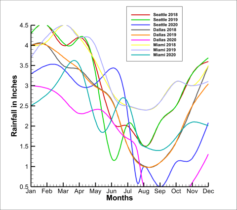
Figure 1. XY-Line Plot – hard to read.
Rainfall data for three cities is plotted over time: Seattle, Dallas, and Miami. Each city has three samples. This results in a total of nine lines on the plot. As you can see in Figure 1, it is not easy to quickly differentiate between the various lines. Although each line is a different color, there is insufficient contrast between them. In addition, although we know there are subsets of data for each city, it is not easy to pick out the related lines quickly.
Line and Marker Styling
Now, look at Figure 2 and see how much easier it is to digest.
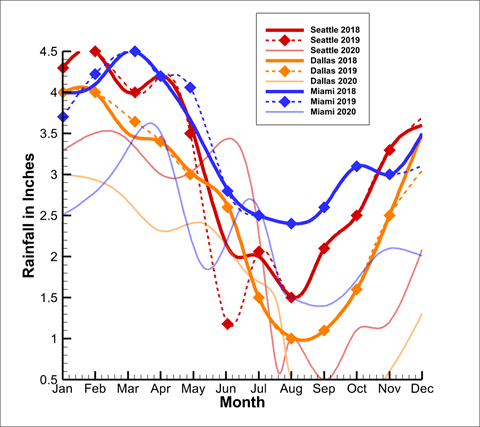
Figure 2. XY-Line Plot – with differentiated lines.
No matter how it’s styled it’s still a lot of data to digest, but the improvement between Figures 1 and 2 is obvious. In Figure 2 we have not reduced the dimensionality of our plot, but we have added line and marker styling to make distinguishing each dataset easier. We have also matched the line color per the city-type. This makes it easy to see which series are related to one another. The moral of the lesson is – be sure to use all the plot formatting tools at your disposal to provide meaningful visual distinction between your datasets. This trick can be applied to much more than just XY line plots – try it on bar charts, scatter plots, and more.
Contour Plots
Whether you think Contours are just pretty colors meant to satisfy managers or a valuable tool for aiding engineering decision making is up to you. But if you’re going to use them, at least use them correctly. We’ll look at two separate issues related to contour plots. The first up: contour levels. Look at Figure 3.
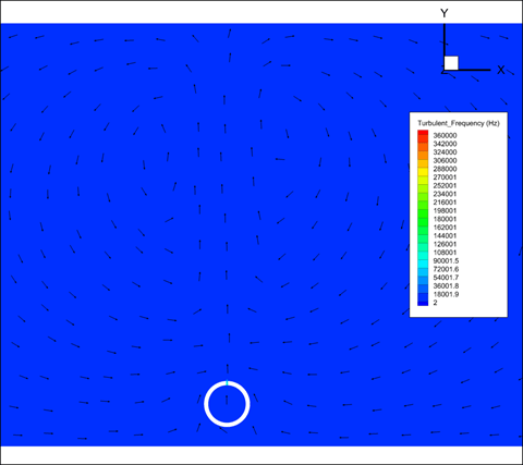
Figure 3. Contour plot – pretty worthless, right?
Pretty worthless, right? Well forgive us if we are using extreme examples to prove our point, but Figure 3 obviously doesn’t tell us much. Contour plots are designed to show gradients of a field variable along a surface or plane. And to that end, you must set the contour levels at an interval that reveals the gradient. Depending on your dataset, you might wish to use a linear or an exponential distribution. To improve Figure 3 on our sample dataset, we’ll choose the latter.
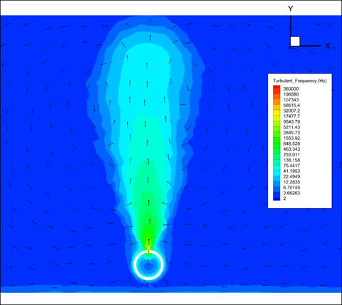
Figure 4. Contour plot showing exponential distribution.
Figure 4 shows the same dataset but uses an exponential distribution to reveal the change in turbulent frequency. Depending on your dataset, you may wish to continue with a linear distribution and ensure your max, min, and interval values are adjusted to highlight the gradient.
Colorblind-friendly Colormaps
Figure 4 is already infinitely more useful than Figure 3, but it can be improved even further by applying another plot trick. Look at Figure 5.
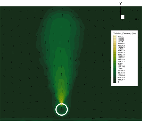
Figure 5. Contour plot with colorblind friendly colormap
In Figure 5 we have the same dataset and the same contour levels as in Figure 4, but now we’ve applied a new colormap. Not only does using a colormap like this one provide a more intuitive sense of the field variable gradient, but it is also colorblind friendly. Colorblindness is not something you hear much about – but it’s a real issue that affects millions of people. Do your audience a favor and make your plots as colorblind friendly as you are able! There are web apps available that can help you evaluate your images.
Plot Zoom Level
Last, but not least, is ensuring that you are plotting your data with a field of view that is appropriate for your results. In this example, we’ll adjust the zoom level on plots showing flow over a cylinder. If the zoom is too far out, pertinent results are washed out by uninteresting far-field values. If the zoom is too close, it’s difficult to discern how the region of interest fits into the broader dataset. Figures 6 and 7 illustrate how NOT to set your zoom level.
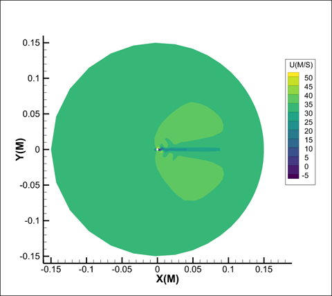
Figure 6. Zoom level is too far out.
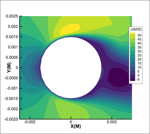
Figure 7. Zoom level is too far in.
Clearly, Figure 6 is zoomed out too far, and therefore gives us a view of the entirety of the far field. The result leaves it unclear what the analysis was of, let alone what the results were. Figure 7 has the opposite problem. The perspective is too close, which shows a clear view of the cylinder but very little information about how the flow develops.
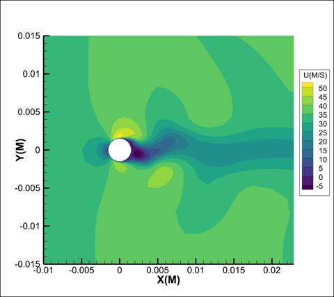
Figure 8. Shows us a zoom level that is just right.
Ahh, that’s better! With the zoom set just right Figure 8 shows us a clear view of the cylinder and a detailed view of the upstream and downstream flows. Of course “just right” may look very different depending on your dataset and what you want to communicate. but just make sure to pay attention to how well your audience can see the pertinent information!
Building visuals to effectively communicate complex data is a very broad discipline, so forgive us if our examples are a tad elementary. The truth is that compelling plot styling can be accomplished in a variety of ways – and only you are in the position to determine what’s right for your data and audience. You’ll be alright if you just make sure it’s easy for your audience to understand your visuals.